Creating a peaceful and relaxing atmosphere in your home often starts with the colors you choose. Calm colors have the power to influence mood, promote tranquility, and make your space feel welcoming and restful. Whether you’re painting a single room or refreshing your entire home, selecting the right shades can make all the difference. In this post, we’ll explore helpful tips for choosing calm colors that can turn your living spaces into serene retreats.
Why Choose Calm Colors?
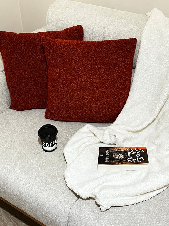
Calm colors, often soft and muted tones, are known for their ability to reduce stress and create a cozy, harmonious environment. Unlike bright or intense hues, calm colors tend to be easier on the eyes and encourage relaxation, making them ideal for bedrooms, living rooms, or any space where you unwind.
Understanding Color Psychology
Before picking colors, it’s useful to understand how different tones affect your mood:
– Blues: Often associated with peace and stability, blue shades can lower heart rates and encourage calmness.
– Greens: Evoking nature, greens foster feelings of balance and renewal.
– Neutrals: Soft beiges, creams, and greys are versatile and provide a soothing backdrop.
– Lavenders and Soft Purples: These colors bring a gentle sense of luxury and calm.
Knowing these basics helps you select colors that suit your emotional needs and the room’s purpose.
Tips for Choosing Calm Colors
1. Consider the Room’s Purpose
Start by thinking about how you use the room. For example:
– Bedroom: Opt for soft blues, lavenders, or pale greens to promote relaxation and better sleep.
– Living Room: Neutral tones mixed with subtle pastels can create a welcoming but calm environment.
– Home Office: Light blues or greens can improve focus while keeping stress levels low.
Matching color choices to room functions enhances both comfort and usability.
2. Start with a Neutral Base
Neutrals like warm greys, off-whites, or beige provide a calming foundation. These colors are timeless and help anchor the space. You can then add subtle accents for interest without overwhelming the senses.
3. Incorporate Soft Pastels
Pastel shades are naturally calming because of their light, muted appearance. Pale peach, mint, powder blue, or blush can add a hint of color while maintaining tranquility.
4. Use Color Samples and Test Patches
Before committing, try paint samples on your walls. Observe them at different times of day and in various lighting conditions. Colors often look different in natural light than they do under artificial lights.
5. Balance with Natural Elements
Pair your calm color scheme with natural elements like wood, plants, or stone textures. These materials work beautifully with serene colors to enhance a peaceful atmosphere.
6. Avoid Overly Bright or Harsh Colors
Bright reds, intense yellows, or neon tones can create stimulation rather than calm. Use these shades sparingly, if at all, in rooms intended for relaxation.
7. Stick to a Consistent Palette
Using a limited palette of 2–3 calm colors throughout your home creates flow and harmony. Too many contrasting colors can disrupt the calm vibe.
Popular Calm Color Combinations
– Pale Blue + Soft Grey + White
– Sage Green + Cream + Natural Wood
– Lavender + Warm Beige + Light Taupe
– Dusty Pink + Soft White + Charcoal Grey
These combinations work well in various spaces and create soothing environments.
How Lighting Affects Color Perception
Lighting plays a crucial role in how colors appear:
– Natural Light: Enhances color clarity but changes throughout the day.
– Warm Light Bulbs: Work well with warm neutrals and soft pastels.
– Cool Light Bulbs: Complement blues and greens but might make some neutrals appear stark.
Test your chosen colors alongside your room’s lighting to ensure the desired effect.
Final Thoughts
Choosing calm colors for your home can transform it into a haven from everyday stress. By understanding color psychology, considering the function of each room, and testing your choices carefully, you can create spaces that invite relaxation and comfort. Remember to keep your palette simple and pair colors with natural elements to enhance tranquility.
Your calm, color-coordinated home awaits—take your time selecting the perfect shades and enjoy the peaceful atmosphere they bring.